Whether we admit it or not, we all have our favourites and when it comes to brands, we are no different. Some of them resonate with us, some of them don’t and the very special few will stick with us for a lifetime. And that’s what sets a brand apart from the rest. With this in mind, we have put together a list of the best and worst rebrands of all time.
Best: Airbnb
When Airbnb was founded, it quickly became hot stuff. Its innovative business idea has of course been a massive factor in their success. But much like any other successful company, its branding has played a big role too.
In 2014, the company transformed its logo and branding, setting itself apart from its competitors with a modernised look and feel. And with that rebrand came a big focus on creating brand awareness for the company, especially via digital advertising.
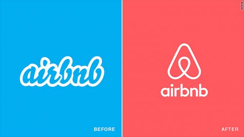
Airbnb took a multi-faceted approach to raise awareness about their brand and the company’s well-designed logo has consistently served as a cornerstone for these digital advertising efforts. Thanks to the recognisability of its logo design, it has been able to quickly grow the level of online interest and awareness necessary to springboard the launch of an all-new accommodation industry.
Their modern rebrand gave the business a much-needed platform to support its growth and within 2 years, increased its revenue by 80%. And though, it didn’t become profitable until late 2016, the brand remains an attractive investment, attracting a grand total of $3 billion in funding.
Worst: Royal Mail
Now, this is a rebrand that we will never forget. In January 2001, when Royal Mail announced it would be rebranding as Consignia, all Brits collectively asked ‘Consigni-what?’
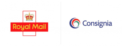
Costing the company £1.5 million to launch, the new branding did not have a very warm welcome, to say the least. Deemed as too long and too fussy, BBC News even referred to the new branding as a “duffer” and a “howling waste of money”.
Just over a year after Royal Mail announced its new brand, it reverted back to its original name and branding, spending another £1 million in the process.
It’s safe to say that this rebrand was not a success, which is why it is classed as one of the worst corporate rebrands of all time.
Best: McDonald’s
Over the past sixty-six years, McDonald’s has developed a strong brand for itself, making it a global success. It is a world-renowned brand and household name. Since it was founded in 1955, it has gone from strength to strength and there are three very big reasons for this.
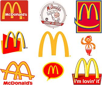
The first reason being their inherent ability to appeal to their target audience. The second is globalisation – you can get one absolutely anywhere, it’s omnipresent. The third and final reason is the brand’s simplicity – those instantly recognisable Golden Arches on a bright red background and catchy, family-friendly advertising. It is simple, straightforward and people know what to expect.
Worst: GAP
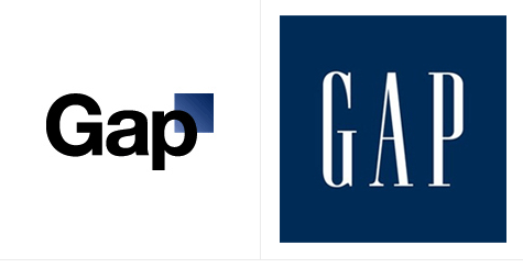
If you don’t remember GAP’s new logo launch in 2010, let us fill you in. When the high street fashion brand opted to transform its logo of over 30 years consisting of its name in a navy square, it went down like a lead balloon and lasted all of six days.
The new logo featured a new font and the word GAP was removed from the square, having a smaller square on the edge of the brand’s name instead. When the new logo was shown discreetly on social media, people reacted badly, which was then met with a bad response from GAP itself.
The company claimed they wanted a more modern logo going forward but then started crowdsourcing ideas for their new brand. Considering they are a multi-million dollar company, that too got a bad reaction, especially from graphic designers who didn’t want to freely give away their ideas to such a wealthy organisation.
After just 6 days of controversy and poor press, GAP’s executive manager decided to keep their old logo, discarding the new one that they had spent so much time and money on. According to recent estimates, the disastrous rebranding cost GAP more than 100 million dollars.
Best: Apple
Apple’s brand awareness is head and shoulders above its competitors, which is why their brand’s success comes as no surprise. From the very beginning, they’ve stuck to the mantra “less is more” and hasn’t it paid off? Apple’s ability to keep its branding simple yet aesthetically pleasing, whilst marketing its products in an exhilarating and sophisticated way all contributes to its massive success.
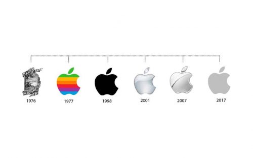
Some of the other reasons why Apple’s brand is so successful include:
- Brand awareness generation
- Experience creation
- Customer trust
- Continuous improvement
- Focus on brand loyalty
Worst: BP
British Petroleum, aka BP, is the world’s third-biggest oil company. In 2000, they changed their logo from a shield to a more modern version, which has been likened to the sun because of its shape – quite ironic considering the sector in which they work.
Until 2010, the logo worked well, which BP must have been grateful for as it is said that they paid an astronomical amount for their rebrand. However, in April 2010, they were responsible for one of the worst oil spills in history, resulting in their brand receiving massive backlash.
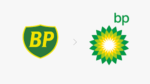
A large quantity of oil spilt from their Deepwater Horizon drilling station in the Gulf of Mexico resulting in major environmental impacts on both plants and wildlife, contradicting their logo that seemed eco-friendly. But coupled with this terrible event, they received major criticism of their brand and their logo in particular. So much so that Greenpeace even asked its followers to redesign it.
Since the oil spill, BP has spent a considerable amount of money on its brand, attempting to recover the reputational damage caused by the spill. After all, reputation takes years to build and a very small amount of time to ruin. For many in BP’s case, it is simply unforgettable.
Developing the right branding for your business takes creativity, commitment, and passion, all of which our team has in abundance. Contact us today by emailing hello@brace.co.uk or give us a call on 01452 729 953. We look forward to working with you.